So you need to make a Flyer for your business, special event, or project and you have no idea where to start. Well first off, no one said you have to be a professional graphic designer to make a decent flyer.
You already know the information that you wish to present. Now all you need to do is stick to certain basic design principles that will give you the confidence that you need to make your flyer stand out. I can't tell you how many times I've seen flyers with serious design flaws.
Basic Flyer Design should focus on a few key areas. I have outlined 10 for you.
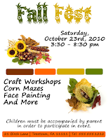
Your Flyer's Title should always stand out from the rest of the information on your Flyer. You need people to be able to see in a split second, who or what you are talking about.
Try using a bolder looking Font. I often use Fonts like Impact, Advert and Manchester for Titles, to name a few. The Title also gives the viewer a clue as to what the Flyer is about.
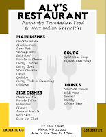
Yes
The Flyer Title is clearly
more visible than the other
Flyer.
| 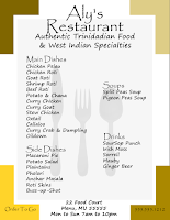
No
You can see the Flyer Title
here but the chosen Font
does not stress its
importance.
|
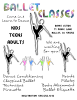
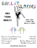
Your Images should always be the right size - not too big or too small, so that they become a distraction and take away from the message of the Flyer. Remember our eyes are usually drawn to images first.
Image is
Too Small
No
Immediately
you notice that
something is off
here. Why is this
Image so small?
|
Image is Proportional
Yes
You scan the
Image and your
eyes move on to
another area of
the Flyer.
|
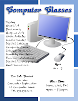
Image is
Too Big
No
The Image is so
big it's running
into the Title and
other Key Text
on the Flyer.
|
Use colors that will both appeal to the viewer, and will look good on screen and in print format. At the end of the day, your Flyer is going to be printed, so you must consider colors that look good on screen may not appear the same when you have an actual copy in your hand. These are things that you need to test for.
Besides the Background Colors, remember you also have to take into consideration your Font Color and Image Color. They all have to work well together.

No My eyes!!!
Just try to picture
some Text and
Images on this
background. Can
you feel the pain?
|

Yes
Adding Images
and Text here,
the viewer will
want to read on
to find out more.
|
Know where your margins are and design your flyer within them. If this is not done correctly, some of the flyer will be missing when you print or even print preview.
Avoid the hassle and confusion this causes. Adjust your margins before you start your design process.

Yes
With Margin set,
there is no problem
on print preview
or printing.
|

No
Everything has to be
readjusted. Costing
you needed time
and diminishing
your patience.
|
Yes, it literally is white space. But there's more to it. White space makes things stand out and your flyer much easier to read. Find the right balance.
Face it, no one wants to read a book when looking at a Flyer. Remember you only have that many seconds to capture your viewer's attention. White space in your friend.
No
This Flyer is still
readable, but so
cluttered, you risk
turning the reader off.
| 
Yes
There's enough
White Space here,
that each area of
this Flyer can get
the attention it
deserves.
|
Your Flyer must have certain information to get your message across to the viewer - Who, What, When, Where, and Why. Omit some of these and it will only leave your viewer with more questions. Follow through with everything your Flyer needs to present in order for it to be effective.
If you're having a special event, like a birthday party or a special sale and you give your address (Where), but no time (When), do you see the predicament? Will the viewer be able to find this out on their own and will they even care to do so?
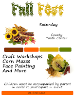
No
This could be an
important event to
some people.
However, there is
no contact info,
time, date, phone
number. Leaving
the viewer with 2
choices - become a
detective or toss
the Flyer.
|
Yes
Flyer provides
enough information
to answer any
questions that
may arise.
|
Don't use too many types of Text Formats in your Flyer, like Bold, Italic, Underline, Highlight, etc. Not only is this distracting, it can become confusing. You don't want to take the focus off your Flyer's message.

Yes
A Flyer with a
clear message.
|

No
A Flyer with so
much going on, the
viewer is distracted.
|
Gear the information on the Flyer around your images and or background. I always work on the Flyer's background, title and images before placing the remaining text details.
It's easier to place these on the Flyer and then figure out where to put Text. I can't imagine it the other way round, putting Text on my Flyer first and then trying to tuck in an Image, Title or Background in this space or that.
|
Yes
Easy to see available
space to place Text.
|
No
Don't even know
where to begin.
|
Will your Flyer catch someone's interest from 5 or 10 feet away? Zoom out of the flyer while you are creating it so that you can see what it would look like from a distance. What catches your eye? Should your image be made bigger?
It's a little trick that I use repeatedly during the design process. It really helps me to determine what works and what doesn't.
Proofread your Flyer repeatedly (ok a couple times) to make sure that there's no words spelt incorrectly and or poor grammar, since these can be a turn off for the viewer.
When you're done that, give it to someone else so that they too can glance over it for you, perhaps catching an error that you may have missed.
Ready to Design?
Stick to these principles to create great flyers with clear messages.
I hope that you have found these tips helpful.
Now it's time to Dabble in Design.
Are there any other design flaws that you can come up with? Leave a comment below!
 For years I used Winzip to unzip files but that changed when I could no longer use the program for free. So I had to come up with another alternative. Luckily I was able to find an Open Source option called 7-Zip. No registration or payment is required. You will need this program or one like it to unzip your font downloads. Remember Open Source applications are free. Find out more about them here: Have you considered Open Source lately?
 I downloaded Minstrel Poster from FontSquirrel.


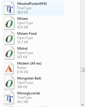 This will open a Font List that you can scroll down to search for your newly installed font.


